
On Box Design I
- elainabuffkin
- May 12
- 2 min read
Greetings, Elaina here!
You may have heard that I fractured my right hand, AKA my drawing hand, but I'm pleased to report I'm back to two handed typing again, so it's time for a blog post. First, thank you everyone that shared feedback on last week's box designs! The truth is, I was having some creative block so I broke my hand as an excuse not to draw for the next two months. Turns out this excuse actually really helped me to think out of the box ... for the box design! I'll take you through the iteration process now with lots of pictures to make up for a lack of art blogs.
Something I have learned in my time making art (though I continue to forget and be reminded of) is that sometimes you need a restriction rather than freedom to facilitate creativity. I was worried about finalizing the project without the ability to make new drawings, but just as I've learned to put my socks on with one hand, so have I learned to reuse our existing assets. And frankly, I feel more inspired and interested in these designs than I ever did the old ones. Below you can see different assets and images that I pulled from existing exports and then recolored or isolated to generate new imagery.

I even created this new version of the time piece, featuring the four characters. It did involve some left handed drawing and was slow going for a while, but it was all worth it because it never even made it to any final iterations. Notice some cool hidden details.

(I jest, it was actually an important step in visually leading me to elevated designs).
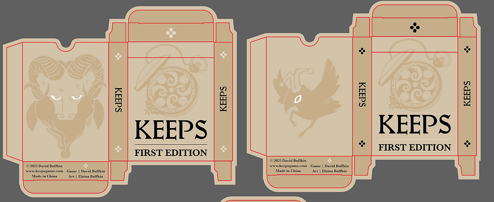
Now look at all these boxes that have emerged since the design vote!

While the Count cards provide a number of standalone silhouettes, The Friar cards were especially rich for box design. How fun is this area:

Which also helped inform the new hero image (or whatever it's called) exploration for the Kickstarter:

Ultimately, we decided to fine tune the dark mode box since many of you seemed to gravitate towards it. Originally, this design featured the timepiece (because it's just so easy to work with and make compositions look more beautiful). I was really enjoying playing with a subdued version like this,

but I shifted to a different dark mode design, Revelation. Revelation not only felt more narratively oriented, but for me, it also connects on a character level and speaks to the vibe of the game. At least, when I play Keeps, I feel like a little mouse in the dark led by the light of my candle. The timepiece started to feel a bit too refined and ornate, even a little steampunk, for my taste. But that little mouse? I would pluck him right off the shelf. So here it is, the final-ish design!


With that, I'm off to first edition box designs and the kickstarter page graphics (until we inevitably need to make edits to the box design again). Here's a little sneak peek, though we might take it in a totally different direction, so don't get too attached....
*Vanilla*.
Thank you all for reading and for your continued support. Farewell for now, friends!
~ Elaina


Comments